Sector Detector: Key inflation metrics should signal ‘mission accomplished’ to the FOMC
 by Scott Martindale
President & CEO, Sabrient Systems LLC
As an update to some of the topics I discussed in my lengthy early-January post, I wanted to share an update in advance of the FOMC announcement on Wednesday based on several economic reports that were released last week.
The Fed’s preferred inflation metric, Core Personal Consumption Expenditures (PCE, excluding food & energy) for December came in on Friday at 2.93% YoY and 0.17% MoM. However, I prefer to focus on the most recent trend over the past 3 months. Annualizing the Core PCE price index change over the past 3 months (0.14% in Oct, 0.06% in Nov and 0.17% in Dec) computes a 1.52% annualized inflation rate, as shown in the chart below.
So, it appears to me that inflation today is likely below the 2% target such that the Fed can begin normalizing fed funds rate toward the “neutral rate” (neither contractionary nor expansionary), which I believe ultimately will be around 3.0% nominal (i.e., 2% target inflation plus 1.0% r-star) versus 5.25–5.50% today. Moreover, I think the 10-year Treasury will settle at about 4.0–4.50%, assuming we don’t continue flood the Treasury market with new issuances to fund fiscal boondoggles and rising debt service (we’ll get a clue on Wednesday with the Treasury Refunding announcement). The rate levels I am suggesting seem appropriate so that borrowers can handle the debt burden while fixed income investors can receive a reasonable real yield (i.e., above the inflation rate) so they don’t have to take on undue risk to achieve meaningful income.
The Fed believes the composition of PCE more accurately reflects current impacts on consumers than does CPI. This is because it more quickly adapts to consumer choices through its weighting adjustments to individual items (e.g., shifts from pricier brands to discount brands). Also, while CPI narrowly considers only urban expenditures, PCE considers both urban and rural consumers as well as third-party purchases on behalf of a consumer, such as healthcare insurers buying prescription drugs. Furthermore, items are weighted differently—for example, shelter is the largest component of CPI at 32.9% but only 15.9% of PCE, and healthcare is the largest component of PCE at 16.8% but only 7.0% of CPI. So, while Core PCE shows a 1.52% 3-month annualized inflation rate, Core CPI is 3.33%.
So, let's talk more about shelter cost. I have often discussed the lag in shelter cost metrics distorting both PCE and CPI, particularly as new leases gradually roll over throughout the course of a year while existing lease rates persist. So, let me introduce another metric published by the BLS that provides more current insights into the trend in shelter cost, namely the New Tenant Rent Index (NTR).
The NTR data peaked in Q2 2022 while CPI Shelter didn’t peak until Q2 2023. And NTR has fallen precipitously since then, showing a substantial -8.75% quarter-over-quarter decline in Q4 2023 versus Q3 2023. But because such QoQ comparisons can be quite volatile with this metric, I’m not going to annualize that number. Instead, let’s stick with the year-over-year or 4-quarter comparison, which shows a more modest (but still significant) decline of -4.74% versus Q4 2022. Although CPI Shelter index is still elevated, it is also falling (as shown in the chart), now showing a YoY rate of 6.15% for December.
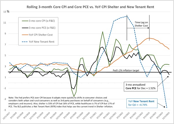
Furthermore, the BLS also publishes an All Tenant Regressed Rent Index (ATRR), which is not restricted only to new leases, so it moves more slowly and with less volatility. ATRR also has been in a steady decline since peaking in Q4 2022 at 7.84%, and it has been steadily falling over the past 4 quarters to its latest Q4 2023 reading of 5.27% YoY, which again reflects rapidly falling rental prices and is in-line with CPI Shelter.
This suggests to me that falling shelter costs will soon be more impactful to PCE and CPI readings. The FOMC is surely aware of this.
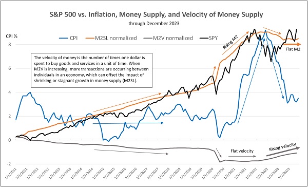
As for other economic reports last week, we saw the BEA’s advance (first) estimate of Q4 GDP growth surprised to the upside at a 3.3% annual rate, largely driven by personal consumption. Also, the December reading for M2SL money supply shows it has stayed basically flat since last March, while velocity of money (M2V) continues to ramp up. This suggests that more transactions are occurring in the economy for each dollar in circulation, which has offset the negative impact of stagnant money supply, thus supporting GDP, corporate earnings, and stock prices—although lack of M2 growth creates other strains on liquidity. I discuss this further in today’s post below.
Click here to continue reading my full commentary. And please feel free to share my full post with your friends, colleagues, and clients! You also can sign up for email delivery of this periodic newsletter at Sabrient.com.
Market commentary:
The chart below compares movements in the S&P 500, inflation, money supply (M2SL), and the velocity of money supply (M2V) since 2011 (updated through December 2023) and how rising or falling velocity has served to offset the impacts of high-growth or contraction in M2. There was a close correlation between rising money supply and rising equity prices (aka asset inflation) until M2 crested in 2022. Since then, the S&P 500 has round-tripped lower and then higher, back to where it was two years ago.
Meanwhile, CPI inflation seemed uncorrelated up until the pandemic lockdowns in 2020, oscillating in a trading range between 0-4% even while M2 steadily rose, at least partly because velocity of M2 was steadily falling, which largely offset the impact of M2 growth. Even during the initial the global pandemic lockdowns when M2 surged, it was offset by a plunge in velocity as much of the new money simply sat in bank reserves and personal savings and investments rather than generate robust new spending (particularly on services, which bore the brunt of the shutdowns).
But when velocity flattened out in 2020-2021 while M2 continued to surge higher, inflation soon followed M2 higher. As M2 crested in 2022 and began to recede (ultimately falling has much as -4.6% from its all-time high in July 2022), velocity commensurately rose, offsetting the negative effects of shrinking money supply so that GDP and stocks have held up while inflation has fallen back towards its historical range. Some modest money supply growth is appropriate for balancing economic growth and liquidity needs with inflation moderation.
As for the previously severe yield curve inversion, it has been gradually flattening, from a low in the 10-2 year Treasury spread of -108 bps last July to -13 bps last week and -21 bps today. This helps to loosen up bank lending standards and supports bank profits as the duration mismatch converges (i.e., paying depositors at higher rates on the short end and lending to borrowers at lower rates on the long end). As I discuss below, the Financials sector is scoring much better in Sabrient’s SectorCast rankings.
It is also notable that corporate credit spreads—including the riskier high yield spreads—remain quite tight, suggesting little worry among yield-hungry bond investors about junk bonds. And why not?, especially given the perceived soundness of the US economy and the Fed’s stated willingness to cut rates when needed (or even sooner, proactively) to mitigate growing strains on heavily leveraged US and global economies.
Although the economy has proven more resilient than many expected in the face of a rapid rise in rates over the past couple of years, there is a risk in keeping rates elevated. And given the inflation indicators discussed here, I think the FOMC will soon begin implementing rate cuts—or more accurately, normalizing interest rates—in a proactive way. Now, you might think that current rates are closer to “normal” from a historical standpoint. But the reality in my view is that businesses, consumers, the housing market, most of our global trading partners, and our own federal government all had become accustomed to low debt carrying costs while taking on lots of debt. As debt rolls over into higher interest rates, carrying costs rise fast—just ask our US Treasury.
So, the “new normal” since the Great Financial Crisis has become lower interest rates. That’s not to suggest we need a return to ZIRP (zero interest rate policy), but it does suggest today’s fed funds rate is too high. Moreover, the Fed’s overnight repo program, which was designed to absorb excess liquidity by paying attractive rates, has been rapidly shrinking, which could threaten a credit crunch—and should further encourage the Fed to rein in its quantitative tightening (QT).
Again, I think a target fed funds neutral rate is around 3.0% (versus 5.25–5.50% today) and the Fed will begin cutting rates before mid-year. Going into this week’s FOMC meeting, current CBOE fed funds futures suggest 46% odds of one rate cut at the March meeting, and by year-end, there’ s 98% chance of at least 100 bps in rate cuts (i.e., a target rate of 4.25–4.50%) and 55% chance of at least 150 bps.
Money market funds continue to gather assets, now approaching $6 trillion, and the S&P 500 has hit a new all-time high. Despite the improvement in market breadth in the second half of last year, this year has begun with a return to leadership from the “Magnificent Seven” (aka MAG7) stocks. So far in January, the cap-weight S&P 500 (SPY) has continued to rise, driven mostly by three of those titans: NVIDIA (NVDA), Microsoft (MSFT), and Meta Platforms (META), while equal-weight S&P 500 (RSP) and S&P 600 Small Caps (SPSM) are flat.
As for equity valuations, the cap-weight SPY still displays an elevated forward P/E of 20.9x (although many commentators say the MAG7 deserve their multiples given their extreme earnings growth, wide business moats, and massive size that allows them to rapidly develop and leverage generative artificial intelligence (Gen AI). Meanwhile, the equal-weight RSP has a forward P/E of 16.9x and small-cap SPSM is at only 14.7x.
Notably, Microsoft recently passed Apple (AAPL) as the largest stock by market capitalization (and is now the only company above the $3T mark). Why? Because China is struggling. I have written about China’s “house of cards” situation for several years, although impressed that it’s able to continually pull a rabbit out of its hat to keep the “Miracle” alive. But the cracks are widening. Its population fell by 2 million in 2023, which reflects the second straight year of falling population. Without much immigration, it relies on births—but although its infamous one-child policy was rescinded long ago, it became ingrained in the culture. Births have fallen for seven straight years, and now its GDP is growing at the slowest rate in 30 years, which has had increasing impact on companies like Apple and Tesla that rely on sales to the Chinese to continue their own rapid growth rates.
Finally, if you are looking outside of the cap-weighted passive indexes (and their elevated valuation multiples) for investment opportunities, let me remind you that Sabrient’s actively selected portfolios include the Baker’s Dozen (a concentrated 13-stock portfolio offering the potential for significant outperformance), Small Cap Growth (an alpha-seeking alternative to a passive index like the Russell 2000), and Dividend (a growth plus income strategy paying a 4.5% current yield). The new Q1 2024 Baker’s Dozen just launched on 1/19/24.
Also, while they are still free to download, I invite you to examine our new product Sabrient SmartSheets—one for individual stocks and one for ETFs, we have expanded the content to include Top 30 lists for each of a variety of our potent quantitative scores. Notably, we have further enhancements in the pipeline to help investors and advisors with stock search, fundamental screening, idea generation, risk monitoring, and confirmation. These sheets are posted weekly in Excel format and show how your stocks and ETFs score in our various alpha factors…or for identifying the top-ranked stocks and ETFs for each alpha factor (or for weighted combinations of the factors). Please check them out and share your feedback with me!
Latest Sector Rankings:
Relative sector rankings are based on our proprietary SectorCast model, which builds a composite profile of each of over 1,000 equity ETFs based on bottom-up aggregate scoring of the constituent stocks. The Outlook Score is a Growth at a Reasonable Price (GARP) model that employs a forward-looking, fundamentals-based multifactor algorithm considering forward valuation, historical and projected earnings growth, the dynamics of Wall Street analysts’ consensus earnings estimates and recent revisions (up or down), quality and sustainability of reported earnings, and various return ratios. It helps us predict relative performance over the next 3-6 months.
In addition, SectorCast computes a Bull Score and Bear Score for each ETF based on recent price behavior of the constituent stocks on particularly strong and weak market days. A high Bull score indicates that stocks within the ETF recently have tended toward relative outperformance when the market is strong, while a high Bear score indicates that stocks within the ETF have tended to hold up relatively well (i.e., safe havens) when the market is weak. Outlook score is forward-looking while Bull and Bear are backward-looking.
As a group, these three scores can be helpful for positioning a portfolio for a given set of anticipated market conditions. Of course, each ETF holds a unique portfolio of stocks and position weights, so the sectors represented will score differently depending upon which set of ETFs is used. We use the iShares that represent the ten major U.S. business sectors: Financials (IYF), Technology (IYW), Industrials (IYJ), Healthcare (IYH), Consumer Staples (IYK), Consumer Discretionary (IYC), Energy (IYE), Basic Materials (IYM), Telecommunications (IYZ), and Utilities (IDU). Whereas the Select Sector SPDRs only contain stocks from the S&P 500 large cap index, I prefer the iShares for their larger universe and broader diversity.
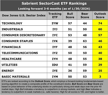
The latest fundamentals-based Outlook rankings continue to display a bullish bias given the predominance of economically sensitive and cyclical sectors at the top. Despite a high forward P/E (29.3x), Technology (IYW) remains in the top spot with an Outlook score of 74, given its strong EPS growth estimates (17.5%), its modest forward PEG (forward P/E to EPS growth ratio) of 1.67, positive earnings revisions from the analyst community, solid return ratios, and strong insider sentiment (open market buying).
Then, there’s a big drop-off to Industrials (IYJ) at 60 and Consumer Discretionary (IYC) at 57. Those 3 are the only ones of the 10 that score above 50, which is somewhat concerning. Consumer Staples (IYK) at 46 and Financials (IYF) at 43 round out the top 5. Notably, Financials is the only sector that moved significantly in the rankings since the beginning of the year, from an Outlook score of 20 to 43 today, mostly due to upward revisions to earnings estimates as the yield curve flattens. Financials also boasts the lowest forward PEG of 1.42.
On the other hand, “deep cyclical” sectors Energy (IYE) and Basic Materials (IYM) are the bottom two. Also notable is that the Energy sector displays the lowest Bull score of 36 and one of the highest Bear scores at 59. Low Bull and high Bear score is usually reflective of a defensive sector, but in this case, I believe it reflects investor sentiment about the impact of rising oil prices on a fragile economy, i.e., helpful to Energy stocks’ earnings outlook but negative for the broader market (like a quasi-tax and inflationary). Similarly, negative earnings revisions for Basic Materials actually serves to reduce producer prices and inflation.
Keep in mind, the Outlook Rank does not include timing, momentum, or relative strength factors, but rather reflects the consensus fundamental expectations at a given point in time for individual stocks, aggregated by sector.
ETF Trading Ideas:
Our rules-based Sector Rotation model, which appropriately weights Outlook, Bull, and Bear scores in accordance with the overall market’s prevailing trend (bullish, neutral, or defensive), maintains its bullish bias. The model suggests holding Technology (IYW), Consumer Discretionary (IYC), and Industrials (IYJ), in that order. (Note: In this model, we consider the bias to be bullish from a rules-based trend-following standpoint when SPY is above both its 50-day and 200-day simple moving averages, but neutral if it is between those SMAs while searching for direction, and defensive if below both SMAs.)
If you prefer a neutral bias, the Sector Rotation model suggests the exact same trio but in a slightly different order: Technology, Industrials, and Consumer Discretionary. Or, if you prefer to take a defensive stance on the market, the model suggests holding Consumer Staples (IYK), Utilities (IDU), and Energy (IYE), in that order (although Financials score highly as well).
As always, I welcome your thoughts on this article! Please email me anytime. Any and all feedback is appreciated! In particular, please tell me what sections you find the most valuable—commentary, SectorCast scores, or ETF trading ideas / sector rotation model. Also, please let me know of your interest in:
1. a Sabrient index for ETF investing
2. the new Sabrient SmartSheets with our full rankings of stocks and ETFs
3. having me speak at your event
IMPORTANT NOTE: I post this information periodically as a free look inside some of our institutional research and as a source of some trading ideas for your own further investigation. It is not intended to be traded directly as a rules-based strategy in a real money portfolio. I am simply showing what a sector rotation model might suggest if a given portfolio was due for a rebalance, and I do not update the information on a regular schedule or on technical triggers. There are many ways for a client to trade such a strategy, including monthly or quarterly rebalancing, perhaps with interim adjustments to the bullish/neutral/defensive bias when warranted, but not necessarily on the days that I happen to post this article. The enhanced strategy seeks higher returns by employing individual stocks (or stock options) that are also highly ranked, but this introduces greater risks and volatility. I do not track performance of the ideas mentioned here as a managed portfolio.
Disclosure: At the time of this writing, of the securities mentioned, the author held positions in SPY, QQQ, TLT, and NVDA.
Disclaimer: Opinions expressed are the author’s alone and do not necessarily reflect the views of Sabrient. This newsletter is published solely for informational purposes and is not to be construed as advice or a recommendation to specific individuals. Individuals should take into account their personal financial circumstances in acting on any opinions, commentary, rankings, or stock selections provided by Sabrient Systems or its wholly owned subsidiary, Gradient Analytics. Sabrient makes no representations that the techniques used in its rankings or analysis will result in or guarantee profits in trading. Trading involves risk, including possible loss of principal and other losses, and past performance is no indication of future results.